CSS is the language of design on the web. It’s used to control how everything looks. The styling of this text, how the article metadata (tags, authors etc) above this looks, everything. It’s what helps define your webpages, and make them look nice… It’s also hard to do well
There’s a ton of things to keep in mind while using CSS:
- Design principles
- Typography
- Colours
- Whitespacing
- Accessibility
- Mobile responsiveness
- Cross-browser support
- etc.
So how do we go about building websites that tick all these boxes without taking years to build?
Traditional Approach
The traditional aproach you might take is to start from scratch, and begin building your CSS incrementally. You start with the outline of some HTML, setup some of the basics, and then start getting specific. We cover how to do this in the ignite scorch course. The problem is that this way takes a long time, and a lot of code (as of writing the CSS on this page is ~9300 lines). There’s also a ton of design and technical things to worry about, like:
- Mobile responsiveness
- Typography
- Accessibility
- Colour theory
- Whitespacing
- etc.
Not only that, but you can run into the blank canvas problem a lot while designing from scratch. Don’t get me wrong, it’s something every developer should know how to do, but not something you should have to do all the time. For the rest of this article, we’re going to talk about tools that will help you to build sites faster, more reliably, and with less headaches!
CSS Frameworks
CSS frameworks are a “batteries included” way to develop a site. For the most part you just plug them onto your site, and they handle lots of the hard design problems for you. The only cost is that it’s often hard to change the decisions they make for you down the road. They’re great for people who don’t want to do design, but still want nice websites!
There are a few types of CSS frameworks.
Component based
Component based frameworks intend to setup “components”, essentially there is pre-built CSS for common things you want to implement. For example there may be a image-round class that rounds images, or an accordion class that let’s you implement something fancier, like this:
<div class="card col-md-4">
  <img class="card-img-top" src="https://images.unsplash.com/photo-1589101545496-c5dcd131213f?ixlib=rb-4.0.3&ixid=MnwxMjA3fDB8MHxwaG90by1wYWdlfHx8fGVufDB8fHx8" alt="Pelican">
  <div class="card-body">
    <h5 class="card-title">Pelican</h5>
    <p class="card-text">What a sick bird</p>
  </div>
</div>
Bootstrap
Bootstrap is what is used to build the ignite site. It’s a very common component library that is used to build millions of sites. It has over 20 built in components, and can be included with 2 lines of HTML (1 link tag for CSS, 1 script for JS). It includes support for:
So what’s the catch. Well generally speaking bootstrap is less optimized than some of the leaner libraries in this article. Convenience comes at the cost of performance and efficiency. That being said, it’s a great choice for your first few sites, sites with tons of people working on the code base, and sites that benefit from being developed quickly while not needing to be the most efficient.
Themes, Plugins and Applications
Because of it’s popularity, there are also a few additional systems built around bootstrap. For example there is a large library of themes from providers like Bootswatch, that will let you build with regular bootstrap, but have a completely different feel.
On top of that there are tons of great IDE plugins/extensions built around bootstrap. One of my favourites is the snippet plugin, which lets you type short codes to insert common bootstrap components.
Additionally there are full featured VIDE’s (Visual Integrated Development Environments) that will let you build out entire sites visually for bootstrap. The most popular is bootstrap studio which you can get a free license for with the github student pack
Bulma
Bulma is an alternative component library to bootstrap. It’s a bit smaller (about 10 components), but it focuses highly on readability, short class names and simplicity. For example here is a tabs component in bulma:
<div class="tabs">
  <ul>
    <li class="is-active"><a>Pictures</a></li>
    <li><a>Music</a></li>
    <li><a>Videos</a></li>
    <li><a>Documents</a></li>
  </ul>
</div>
Primer
Primer CSS is made by the github team, and it’s what they use at github to style their components. As such it has lots of cool components that are useful if you’re building applications or tools around code!
These include:
On top of that it has:
Picnic CSS
Picnic CSS is another smaller library that gives you a few of the basics, and a decent grid system. The selection of components is admittedly a bit… odd (why is there a drop image, but no accordion?).
It’s quite a bit smaller than others in this list (7kb total vs 25kb for bootstrap), making it great for smaller apps where you need the features it offers. If you only need what it supports then it’s a great option!
Spectre
Spectre is a framework that has a few advantages over bootstrap:
- It is smaller (10kb vs 25kb for something like bootstrap)
- faster to load
- Includes components not found in bootstrap for more app-interfaces (like chips,empty states, and steps)
On top of this much of the HTML itself is simpler than the equivalent in bootstrap (accordions for example ). But the most interesting is some of the stuff they’re doing in their experiemental section such as:
And more!
Cons of Component based
While component based systems seem great, there are a few general downsides to go with the upsides:
- You are often committed to someone elses design philosophy
- If you change components radically it’s a lot of work to move to new versions
- The CSS is often way more than you need, and wastes resources and time loading
- Lot’s of things are very magic and can make it hard to debug
Semantic CSS
Semantic CSS are CSS libraries that are designed to do things that are similar to component systems, except without any (or very few) classes. You write plain HTML and it does the rest. This is ideal for super simple sites that don’t need to be super flashy, or as a base to build from.
Pico CSS
Pico CSS is an incredibly lightweight component system that is designed to be simpler than other systems like bootstrap. It’s designed to allow you to just use normal HTML, and have it be styled nicely. For example with other libraries you might find a pattern like this (taken from their site):
<form class="form form-modifier margin padding align">
  <div class="input-wrapper input-wrapper-modifier margin padding">
    <input type="text" class="input input-type-modifier input-style-modifier input-size-modifier">
  </div>
  <button type="submit" class="button button-style-modifier button-size-modifier action-trigger margin padding">
    Action
  </button>
</form>
and pico would instead do:
<form>
  <input type="text">
  <button type="submit">Action</button>
</form>
On top of this super simple approach it bundles some of the harder to implement components in more semantic HTML!
Alternatives
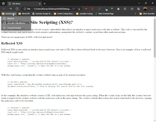
There are a ton of alternatives, but they’re pretty similar, so whichever you pick largely comes down to preference. Many of these will also feature bookmarklets, which is a fancy function you can put in the bookmarks of your browser and drag it onto any page to apply styling to it. Essentially if you put javascript: in the URL of a page, you can get it to run a javascript function. Since the CSS styles default HTML, all you do is get javascript to download and apply the CSS, and it will automatically apply the CSS.
Here are some alternatives
Cons of Semantic CSS
While nice and simple there are a few potential issues with semantic CSS:
- It usually only handles the bear minimum, but even then many tags are unstyled
- While many support themeing, a lot of them require scss to do it which adds complexity
- Many of them have dark themes, but they are seperate stylesheets instead of just data variables, which wastes resources to load
Boilerplate
Boilerplate CSS frameworks do the bare minimum to help you get started, and that’s it. They’re designed to be fast and simple, and are a great way to start on something you mostly wanna design yourself, but will get the basics out of the way.
| Name | Description/features | Link |
|---|
| Skeleton | an incredibly small (~400 lines), library that gives you a responsive grid system, typography, buttons, forms, code, tables, and utility classes. Everything else is up to you! | http://getskeleton.com/ |
| Milligram | a 2kb, it handles the same sort of stuff as skeleton, but includes a few extra bells and whistles (like quotes). It’s a great starting point for a design. | https://milligram.io/ |
| Typesettings | just a stylesheet for typography. Everything else is your problem! | https://mikemai.net/typesettings/index.html |
| Vanilla CSS | A great place to start from, include noraform for even nicer forms | https://vanillacss.com/ |
| Bare CSS | Will set defaults that will automatically turn off when you put classes on your elements. Making it a great starting place to build itteratively | http://barecss.com/ |
Compared to semantic CSS these are often even less feature filled (and therefore also smaller), and require you to build anything more complicated than the essentials yourself.
Extensions
Extensions simply aim to extend CSS. Whether it be with variables, improved nesting, or fancy ways of handling more complicated calculations for you. You are still writing all the stylesheets yourself, but they serve to just make it easier to do common tasks, and sand down some of the rough edges of CSS.
SASS/SCSS
SASS(Syntatically Awesome Style Sheets)/SCSS (sassy CSS) are an example of CSS extensions. They are by far the most popular, and many systems (including bootstrap) offer SCSS on top of traditional CSS. Both are compiled, meaning you have to run some code to convert them to CSS files before you can use them. You can’t just use .scss or .sass files in place of .css files.
SASS and SCSS are different, here is an article explaining the differences here. The basics are that SCSS can use existing CSS, and just extends CSS normally, whereas SASS is a whole new language. You can easily convert between the two using online converters. The big advantage with SCSS is it’s much more concise, arguably easier to read, and makes variables way easier. Here is an example of complicated nesting being easier with SCSS:
*{
    box-sizing: border-box;
    margin:0;
    padding: 0;
}

.card{
    /*Style the card class and all sub-components*/
    border-radius: 50%;
    background-color: #ccc;

    .title{ /* Any title class element inside the card*/
        font-family: serif;
        font-size: 1.5em;
    }

    p{ /* Any paragraph tag inside the card*/
        font-size:1.2em;
    }
    .body{ /* Any body class element inside the card*/
        font-size:1.1em;

        figure{ /* Any figure element inside the body, inside a card*/
            width: 25%;
            border-radius: 1% 5%;
        }


    }
}

article{
    /*Style the article tag and all sub-components*/
    background-color: #141414;
    color: white;

    figure{
        /*Any figure  element inside an article*/
        border-radius: 5% 8%;
    }
}
Will then expand the nested styles into this css:
* {
	 box-sizing: border-box;
	 margin: 0;
	 padding: 0;
}
 .card {
	/*Style the card class and all sub-components*/
	 border-radius: 50%;
	 background-color: #ccc;
}
 .card .title {
	/* Any title class element inside the card*/
	 font-family: serif;
	 font-size: 1.5em;
}
 .card p {
	/* Any paragraph tag inside the card*/
	 font-size: 1.2em;
}
 .card .body {
	/* Any body class element inside the card*/
	 font-size: 1.1em;
}
 .card .body figure {
	/* Any figure element inside the body, inside a card*/
	 width: 25%;
	 border-radius: 1% 5%;
}
 article {
	/*Style the article tag and all sub-components*/
	 background-color: #141414;
	 color: white;
}
 article figure {
	/*Any figure element inside an article*/
	 border-radius: 5% 8%;
}
Less
Less is not compiled, instead you can just include the javascript file in the same page as your less files. It’s very similar in advantages to SCSS, but beter in cases where you can’t compile ahead of time. It also allows you to modify your configurations per-page, since the configuration is done in javascript. The exact same example as the SCSS example will work in Less as well.
Cons of extensions
While they can be useful, extensions bring their own problems:
- You & anyone working with you will need to install them and have them setup to work on a project
- Each has it’s own opinions and skills aren’t always transferrable
- Often the difference for smaller projects is dozens of lines of code and not really worth it
Utility Classes
Utility classes is a newer approach. Essentially it’s the same CSS you know, but it uses classes to do everything instead of inline CSS. This gives the advantage of being able to see exactly what’s happening to an element, while keeping it shorter than regular CSS. Additionally it allows for abstractions, like giving you text sizes in title, main, accent instead of every size under the sun, or colours in terms of green, green-dark, green-light etc. Essentially similar to boilerplate CSS it just tries to let you take the reigns while making things easier.
There is a downside to using these though…
Because they aren’t component based there can often be very long class names. It’s a joke in the community that Utility libraries are just inline styles. There are interesting arguments for why they are more than that, but either way let’s dive into some examples and you can decide for yourself.
Tailwind
Tailwind is by far the most popular, and most controversial of utility class systems. It uses classes to allow you to change individual settings (margin, padding etc.), but also gives you things like the typography plugin that make designing text-heavy sites much easier. They have a playground, which will let you mess around with tailwind without having to set it up!
Here is an example of a banner with 2 buttons on it:
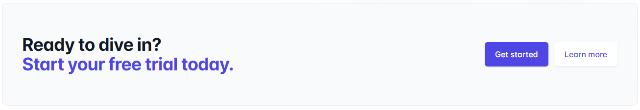
<div class="bg-gray-50">
  <div class="mx-auto max-w-7xl py-12 px-6 lg:flex lg:items-center lg:justify-between lg:py-16 lg:px-8">
    <h2 class="text-3xl font-bold tracking-tight text-gray-900 sm:text-4xl">
      <span class="block">Ready to dive in?</span>
      <span class="block text-indigo-600">Start your free trial today.</span>
    </h2>
    <div class="mt-8 flex lg:mt-0 lg:flex-shrink-0">
      <div class="inline-flex rounded-md shadow">
        <a href="#" class="inline-flex items-center justify-center rounded-md border border-transparent bg-indigo-600 px-5 py-3 text-base font-medium text-white hover:bg-indigo-700">Get started</a>
      </div>
      <div class="ml-3 inline-flex rounded-md shadow">
        <a href="#" class="inline-flex items-center justify-center rounded-md border border-transparent bg-white px-5 py-3 text-base font-medium text-indigo-600 hover:bg-indigo-50">Learn more</a>
      </div>
    </div>
  </div>
</div>
As you can see, some of the lines get hard to read. For example the link tag has 13 classes! But arguably it’s also more clear what is effecting it since the classes are inline. On top of this there are other advantages to tailwind. For example if you set it up how they recommend, it will automatically remove unused CSS. This might not seem like a big deal, but for large and/or populat applications this can save a lot of money on bandwidth, and load times.
TailwindUI
TailwindUI is a component library built by the tailwind team. It isn’t cheap, but it is built well, and comes with a ton of great tailwind template sites as well! The example banner above comes straight from tailwind UI!
It also is constantly updated with new components and fixes, which makes the lifetime license really handy. If you really like tailwind, and want to support the developers then this is a great way to do it while getting a great product out of it!
DaisyUI
DaisyUI is a free alternative tailwind based component library! It has almost 50 components, several themes, and support for a ton of frameworks as well as plain CSS through a CDN. For example here is an accordion/collapse in daisyUI:
<div class="collapse">
  <input type="checkbox" />
  <div class="collapse-title text-xl font-medium">
    Click me to show/hide content
  </div>
  <div class="collapse-content">
    <p>hello</p>
  </div>
</div>
Tailwind Elements
Tailwind elements is another free component library, built in a bootstrap style and based on tailwind. This can be handy because it allows you to get the benefits of CSS purging, and being able to make modifications using tailwind. While having the simplicity of a bootstrap-style approach.
TurretCSS
Turret CSS is another utility class system that is designed to help you build elements quickly. It uses a bit of a different syntax.
The approach is:
<element class="[element] [element-modifier] [element-style]"></element>
So, for example with a button that has the primary colour (blue by default):
<button class="button button-border button-primary"></button>
It’s designed to make utility classes more “semantic”, so when you’re reading the names they map onto something that is obvious and offer an easy way to modify from there.
Cons of Utility classes
I mentioned a few before, but here are the main potential cons of utility classes:
- If you are building “components” you end up repeating yourself constantly
- Complicated designs often require incredibly long (71 in this case!) class names that make it hard to read
- You typically have to setup the system that builds your utility classes
- You have to learn the semantics of the particular utility class system you’re using, whereas CSS is universal
React
React is a component-based UI framework. This means it has it’s own code that (often) runs inside nodeJS. Instead of having the seperation of HTML/CSS/JS, react takes over all 3 (mostly). It uses javascript (or typescript), or optionally a language called JSX. This means it can encapsulate all of the state, and look of a component all in one class!
Here is an example of a react component that is using JSX to create a timer that goes up by 1 each second:
class Timer extends React.Component {
  constructor(props) {
    super(props);
    this.state = { seconds: 0 };
  }

  tick() {
    this.setState(state => ({
      seconds: state.seconds + 1
    }));
  }

  componentDidMount() {
    this.interval = setInterval(() => this.tick(), 1000);
  }

  componentWillUnmount() {
    clearInterval(this.interval);
  }

  render() {
    return (
      <div>
        Seconds: {this.state.seconds}
      </div>
    );
  }
}

root.render(<Timer />);
Because of it’s extensibility react can be used to put together entire applications! In fact the larger your application the better react tends to scale because everything is in one place. This was actually why it was created by meta in the first place. Like bootstrap or other CSS frameworks you can create libraries of components that can be reused (in fact bootstrap is available in react!
Mantine UI
Mantine UI is a component library built for react that is completely free and comes with 100+ components! It works with other frameworks outside of react as well. On top of that it also features:
Material UI
Material UI is a component library for react that includes a ton of components for building websites using react. The core is free, and you can pay for extras.
It has extra features such as:
React alternatives
There are a few alternatives to react you can check out like:
Cons of react
While having everything in one spot is great, there can be a few cons with react:
- Everything is in javascript/jsx (CSS, JS, HTML), so there’s no seperation of concerns
- React uses lots of abstractions, so when you learn it you will often learn the abstractions and what it’s actually doing is “magic” under the hood
- Often times people make react do a lot, it’s common to find codebases with react and 10-12 other libraries that are integrated with react that you have to learn before you can start working
- React can create weird problems, that then require layers of tools to solve (bundling/code-splitting, complex state management, installing “magic” packages to “avoid complexity”, etc. )
- Some react projects require a server, some don’t. It’s always safer to assume you will need a server and the complexity and maintenance that comes along with that (if it’s a plain static site probably better to look elsewhere)
- React has changed a lot over the years, and as it has changed it will often break old projects or completely shift design philosophies that make your code out of date
CSS Generators
CSS Generators are just tools that will help you generate CSS. There are a ton of CSS properties that are hard to remember the syntax for, like borders, or shadows, or animations. These sites will help you generate some common hard to remember CSS:
Design Trends
There are often design trends in the world that people want you to build a site around. Sometimes it’s hard to remember exactly how to implement them all. Here are a few sites that have generators for some common design trends:
Backgrounds
Finally, sometimes it’s hard to pick a nice background. Whethere it’s a hero, or just an element that needs a bit of flair. These sites will help you generate great backgrounds: